Sizzle.ng Digital Marketing Platform Website Design
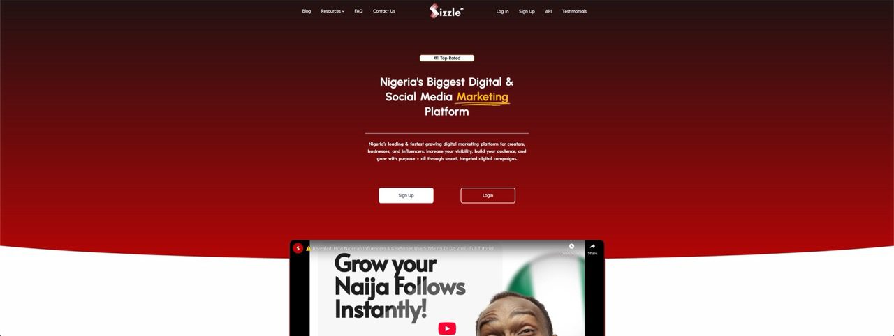
DIGITAL MARKETING SMM PLATFORM WEBSITE DESIGN FOR SIZZLE.NG Sizzle Nigeria Home Website […]


Responsive Web Design means your website works everywhere.
Not just on laptops.
Not just on “some phones”.
Every screen. Every size. Every device.
At Sizzle Digital, we provide professional responsive web design services in Nigeria that ensure your website automatically adjusts to smartphones, tablets, laptops, and desktop screens without breaking layout, usability, or performance.
Your website should feel intentional on every device.
Not squeezed.
Not awkward.
Not broken.

Let’s be honest.
Most of your visitors are on mobile.
If your website:
• zooms awkwardly
• hides buttons
• breaks layouts
• loads slowly on phones
You’re losing customers before they even read your message.
Responsive web design ensures:
• Smooth navigation on all devices
• Faster load times on mobile
• Better SEO rankings
• Higher engagement and lower bounce rates
• Consistent brand experience
Google prioritizes mobile-friendly websites.
Users expect them.
There’s no debate anymore.

Our responsive design process includes:
• Mobile-first layout planning
• Flexible grids and scalable UI elements
• Adaptive images and media handling
• Touch-friendly navigation and buttons
• Cross-device testing and optimization
• Performance optimization for mobile networks
We don’t “resize” websites.
We design them to respond intelligently.
Responsive design is easy to claim.
Hard to execute properly.
Why clients trust Sizzle Digital:
• Mobile-first design philosophy
• Clean, future-proof code structure
• SEO-optimized responsiveness
• Consistent UI across all screens
• Faster load times and smoother interactions
• Designed for real Nigerian users and devices
Your website won’t just pass a mobile test.
It will feel right on every screen.
• Business websites
• Corporate websites
• E-commerce platforms
• Landing pages
• SaaS platforms
• Blogs and content sites
If people visit your website from different devices, responsive design is not optional.

Sizzle Digital stands out as a top responsive web design agency in Nigeria because we understand how people actually browse the internet today.
On buses.
In offices.
Late at night on phones.
On tablets during meetings.
Responsive design is not a feature.
It’s the foundation.
We build websites that move with your users, not against them.
Responsive web design is an approach where a website automatically adjusts its layout, images, and elements to fit any screen size. Whether someone is browsing on a smartphone, tablet, laptop, or desktop, the website rearranges itself to remain easy to read, navigate, and use without zooming or horizontal scrolling.
Yes, they are different. Mobile design often focuses only on phones, sometimes as a separate version of a website. Responsive design, on the other hand, covers all screen sizes in one unified website, ensuring a consistent experience across phones, tablets, laptops, and desktops without maintaining multiple versions.
Responsive design is important because users access websites from many devices today. A non-responsive site frustrates visitors, increases bounce rates, and reduces trust. A responsive website improves usability, keeps users engaged longer, and increases the likelihood that visitors take action, such as contacting you or making a purchase.
Google does not explicitly “require” responsive websites, but it strongly favors them. Google uses mobile-first indexing, meaning it evaluates the mobile version of your site first when ranking pages. Responsive websites tend to perform better in search results because they deliver a better mobile experience.
Yes. An existing website can be redesigned or optimized to become fully responsive. This may involve restructuring layouts, adjusting styles, improving mobile navigation, and optimizing images so the site works smoothly across all devices without rebuilding everything from scratch.
Yes, responsive design has a positive impact on SEO. It reduces bounce rates, improves page experience, and eliminates issues caused by separate mobile URLs. Search engines prefer responsive websites because they are easier to crawl, index, and rank effectively.
In modern web development, responsive design is often considered a standard feature. Costs depend on the complexity of the project and whether an existing site needs restructuring. While it may add effort to older websites, it saves money long-term by avoiding the need for separate mobile versions.
When implemented correctly, responsive websites can load faster, especially on mobile devices. Techniques like image optimization, flexible layouts, and performance tuning ensure that users only load what their device needs, improving speed and overall experience.
Absolutely. Responsive design is critical for e-commerce because many shoppers browse and buy using mobile phones. A responsive store ensures product pages, carts, and checkout flows work smoothly on all devices, reducing abandoned carts and increasing sales.
Responsive websites are tested on smartphones, tablets, laptops, desktops, and various screen resolutions. This ensures the layout, navigation, and interactions remain consistent and functional regardless of device size or orientation.
Yes. A responsive website removes friction for users. When visitors can easily read content, click buttons, and complete forms on any device, they are more likely to convert. Better usability directly leads to higher engagement and improved conversion rates.
Responsive design is one of the most future-proof approaches available. Because layouts adapt fluidly, new screen sizes and devices can be supported without rebuilding the website. This flexibility protects your investment as technology evolves.
Yes. Mobile-first design means we start designing for smaller screens first, then scale up for larger devices. This approach ensures essential content and functionality work perfectly on mobile, where most users begin their journey.
Your website will look consistent in branding, colors, and content, but optimized for each screen size. Elements may reposition or resize to ensure the best experience on every device, rather than forcing the same layout everywhere.
Yes. Responsive design is included in all Sizzle Digital website packages. Every website we build is designed to function seamlessly across devices without requiring additional upgrades or separate mobile versions.
Yes. When users can easily navigate and read your website on their device, they are more likely to stay longer. Responsive design removes frustration, improves usability, and significantly reduces bounce rates, especially for mobile visitors.
Yes, it can positively affect loading speed when optimized properly. Responsive techniques ensure devices load appropriate assets, improving performance on slower mobile networks while maintaining quality on larger screens.
Yes. Depending on your package, you can request revisions focused on responsiveness, such as layout adjustments, mobile navigation improvements, or performance tuning to ensure your website works exactly as expected on all devices.
Yes. A single responsive website is easier to manage, more cost-effective, and better for SEO than maintaining separate desktop and mobile sites. It also ensures a consistent user experience across all devices.
Getting started is simple. You can order directly through our shop page or contact our team to discuss your project. We’ll assess your needs, recommend the best approach, and begin designing a responsive website that fits your goals.
At Sizzle Digital, every great digital transformation starts with a conversation. Whether you’re ready to build your website, grow your brand, launch your next campaign, or just explore what’s possible - this is your first step. Let us bring your vision to life
Discover our portfolio of innovative projects that showcase how we craft impactful digital solutions, each tailored to the unique goals and challenges of diverse businesses across industries
DIGITAL MARKETING SMM PLATFORM WEBSITE DESIGN FOR SIZZLE.NG Sizzle Nigeria Home Website […]
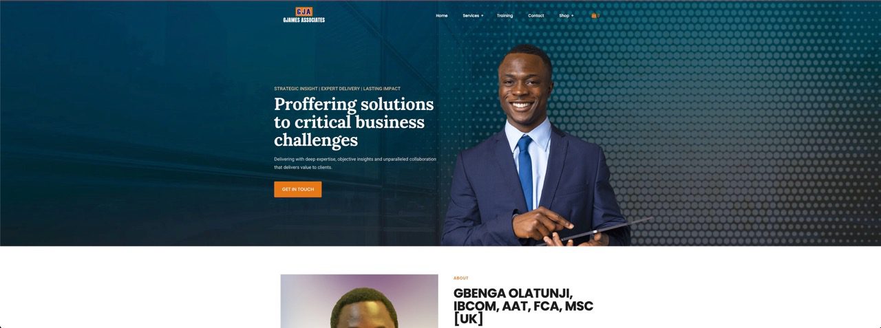
CHARTERED ACCOUNTING FIRM WEBSITE DESIGN FOR GJAMES ASSOCIATES GJames Associates Home Website […]
PERSONAL BRAND WEBSITE DESIGN FOR AYOMIDE JOHNSON Ayomide Johnson Home Website Design […]
Be part of the growing Sizzle Digital community. Don’t miss another digital update, growth hack, or resource.


Our digital services empower brands with innovative strategies and solutions for sustainable growth and engagement.


Discover how our innovative solutions have empowered Nigerian businesses & brands through the voices of our satisfied clients.


Working with Sizzle Digital was the best decision I made for my brand this year. From content strategy to execution, everything was top-notch. They really understand digital marketing, especially for the Nigerian audience.


We partner with the most reliable digital marketing, design, and automation platforms to help your business grow online. Our tech stack includes HubSpot, Figma, WordPress, Google Ads, Meta Ads, Shopify, LinkedIn Ads, and many more – ensuring every campaign we run and every website we build is backed by cutting-edge tools and global best practices.


Join our creative community to collaborate, innovate, and thrive together. We welcome passionate individuals & brands
Sizzle Digital is a full-service digital agency based in Nigeria, helping local brands, startups, and creators succeed online through impactful web design, strategic marketing, and creative branding. We bring together smart strategy and brilliant execution to deliver results that matter – from more traffic and leads to better engagement and sales. Whether you’re just starting out or scaling up, we’re here to be your digital growth partner.
Copyright © 2026 All Rights Reserved.